









SWEETCH case study artwork: two interlocking purple loops opening onto a lit path, a profile lit from within
CASE STUDY · SWEETCH

Making Personalization
Worth the Effort

Designing chronic care around a simple exchange: patient effort should return patient value.

Role
UX Researcher + Designer
Scope
End-to-end UX
Project
New-generation MVP
Project Snapshot

SWEETCH

Digital health · chronic care

A mobile app that uses daily health context to provide personalized guidance.

My Role
UX Researcher + DesignerEnd-to-end UX ownership
The Work
Research and design for a new-generation MVP of the existing product.
Team
Product Manager + UI Designers
Chapter I

The Problem

The app needed data. Patients needed a reason.

At first glance

The challenge looked like engagement.

SWEETCH could provide increasingly personalized support as it learned more about a patient's daily life — medication, activity, nutrition, sleep, measurements and routines.

But that required context.

Some could arrive automatically. Some had to be actively contributed by the patient.

Two halves of one dependency — what the product could see on its own, and what it had to ask for.

Captured automatically

Some signals could enter the system through devices or integrations.

  • Movement & location
  • Connected device
  • Synced measurements
Contributed actively

Other parts of daily life still depended on the patient reporting them.

  • Meal logging
  • Manual entry
  • Reported measurement

A reciprocal dependency

SWEETCH needed context to create value. Patients needed value to keep providing context.

The exchange underneath the experience

  1. Patient effort
  2. Context
  3. Personalization
  4. Insight & guidance
  5. Patient value

Value returned becomes the reason to keep participating

When the exchange weakens

Less context → weaker personalization → less useful guidance → less value

The problem underneath the brief

The challenge was bigger than making logging easier or making the app more engaging.

How could we make the ongoing effort of self-tracking feel worth it?

Chapter II

What Makes the Effort Worth It?

Research revealed what the experience needed to give back.

Back to the core problem

Patient effort → Patient value

Once the exchange became clear, the next question became:

What makes participation worth continuing?

Research focus
  • What feels meaningful?
  • What kind of progress matters?
  • What should the experience give back?
Research approach
  • Focus groups
  • User interviews
  • A/B testing
  • Literature review
  • Competitive research
From research to experience strategy

I synthesized the research into four principles for the experience.

  • pillar 1 visual — to be suppliedPillar 1

    Give the effort meaning

    Connect daily actions to a health goal that genuinely matters.

  • pillar 2 visual — to be suppliedPillar 2

    Turn data into understanding

    Surface patterns, insights and useful next steps.

  • pillar 3 visual — to be suppliedPillar 3

    Make progress visible

    Show change and consistency — now and over time.

  • pillar 4 visual — to be suppliedPillar 4

    Make support relevant

    Guide when it helps; stay quiet when it doesn't.

These principles became a common lens for the product.

The decision test

Does this ask the patient for effort?

If it does, how does it return value?

The next step was applying that lens to the moments that shaped the experience.

Next — Designing the Value Loop
Chapter III

Designing the Value Loop

One strategy, applied across the moments that shaped the experience.

The principles only mattered if they could guide real product decisions.

Different moments in the experience created different versions of the same tension: SWEETCH needed something from the patient, and the experience needed to make that ask worthwhile.

Patient effort → Patient value

Give the effort meaning

Goal · tasks · progress

Daily tracking was where the effort happened. The question was what could make that effort meaningful.

The local problem

SWEETCH needed patients to keep logging meals, medication, activity and measurements. But helping the app collect data wasn't a reason for patients to keep doing the work.

Research

I explored what could sustain motivation over time through multiple research inputs.

Methods / sources
  • Literature review
  • User interviews
  • Focus groups
  • Competitive research
  • Brainstorming / workshops
Research lens

Scott Nicholson — "A RECIPE for Meaningful Gamification" (2015)

For long-term behavior change, gameful systems should help people build personal meaning and connection rather than depend only on external rewards.

What I learned

The Critical Distinction: External vs Intrinsic Motivation

Research consistently shows that unless rewards connect to something personally meaningful, they fail to support long-term engagement.

External motivation

Driven by outside rewards and validation

Illustration of a patient looking at a phone showing points, badges and rewards.
  • Points, badges, and reward systems
  • Short-term engagement boost
  • Diminishing returns over time
  • Risk of gaming the system
Intrinsic motivation

Driven by personal meaning and purpose

Illustration of a person on a hillside looking toward a path leading to a sunrise.
  • Meaningful connection to personal values
  • Sustainable long-term engagement
  • Positive behavior integration
  • Authentic commitment
  • Self-directed goal achievement

The experience move

Research showed that sustained engagement depended on connecting daily tracking to patients' internal motivation — the health outcomes they personally wanted to achieve. I translated that insight into a new product layer: personal goals, linking daily actions, progress and guidance to those outcomes.

BeforeA domain-based experience
  • Nutrition · Activity · Medication · Sleep
  • Collect health information
  • Show progress + personalized guidance
AfterPersonal goals became a new organizing layer across the experience
  1. My goals

    Define what matters most to me

  2. Onboarding

    Define what I want to achieve

  3. Homepage

    Keep my goals visible

  4. Health domains

    Connect actions to goals

  5. Long-term progress

    See how I'm doing

  6. Personalized guidance

    Help me succeed, adjust and learn

Product impact

Make the Goal the heart of the experience.

This insight did not remain a principle.

It became a concrete part of the product.

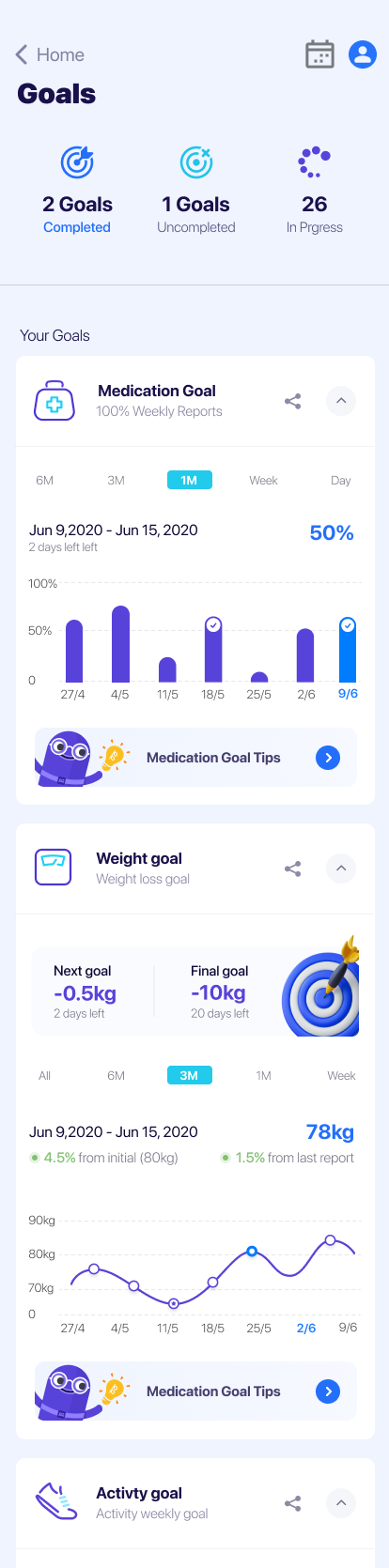
SWEETCH Goals page: completed and in-progress goal counts with medication, weight and activity goal cards.
A new Goals page

A dedicated Goals area gave users an overview of what they were working toward and insight into their progress.

SWEETCH bottom navigation bar with Goals as a primary tab.

GOALS became a primary tab in the navigation.

Goals page — overview of what the patient is working toward.

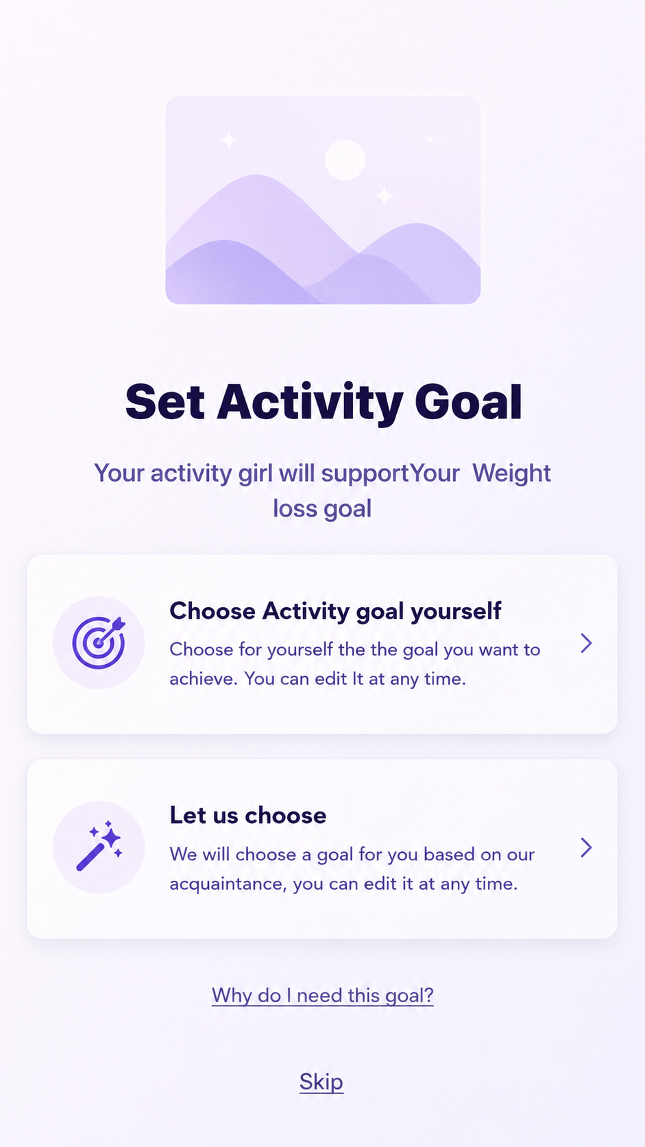
Set Activity Goal screen offering to choose the activity goal yourself or let SWEETCH choose.
01
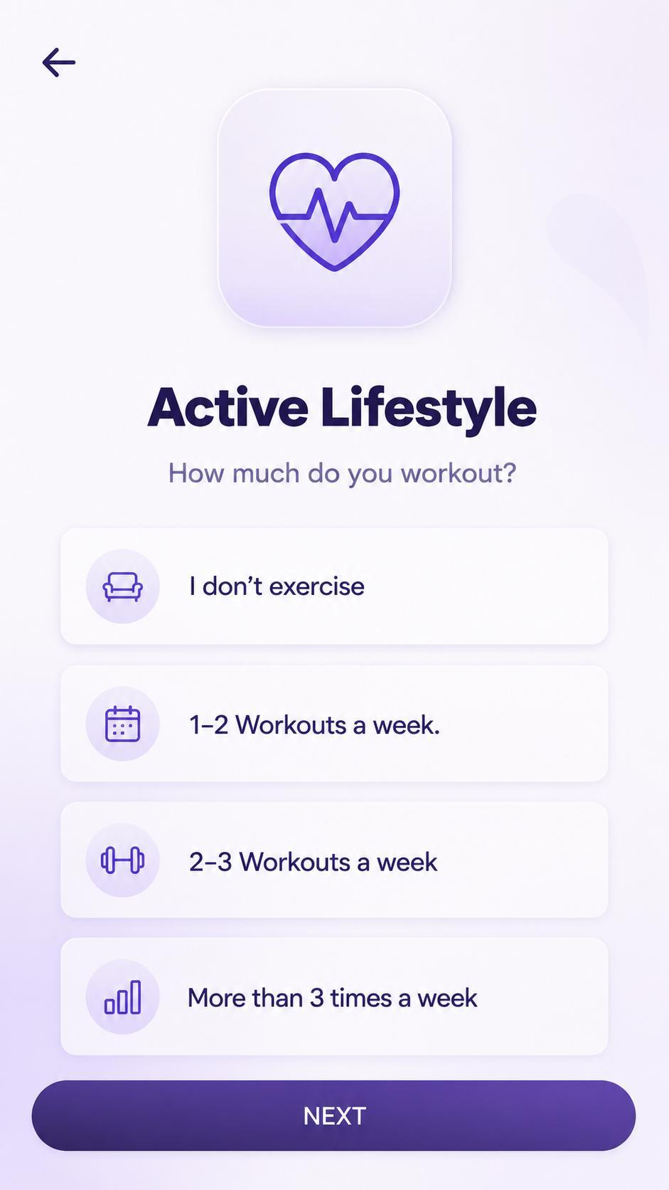
Active Lifestyle screen asking how much the patient works out each week.
02
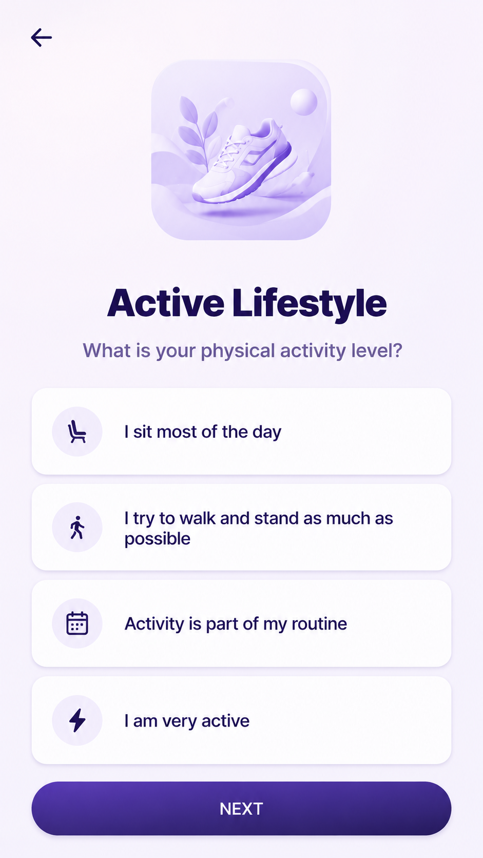
Active Lifestyle screen asking about the patient's daily physical activity level.
03
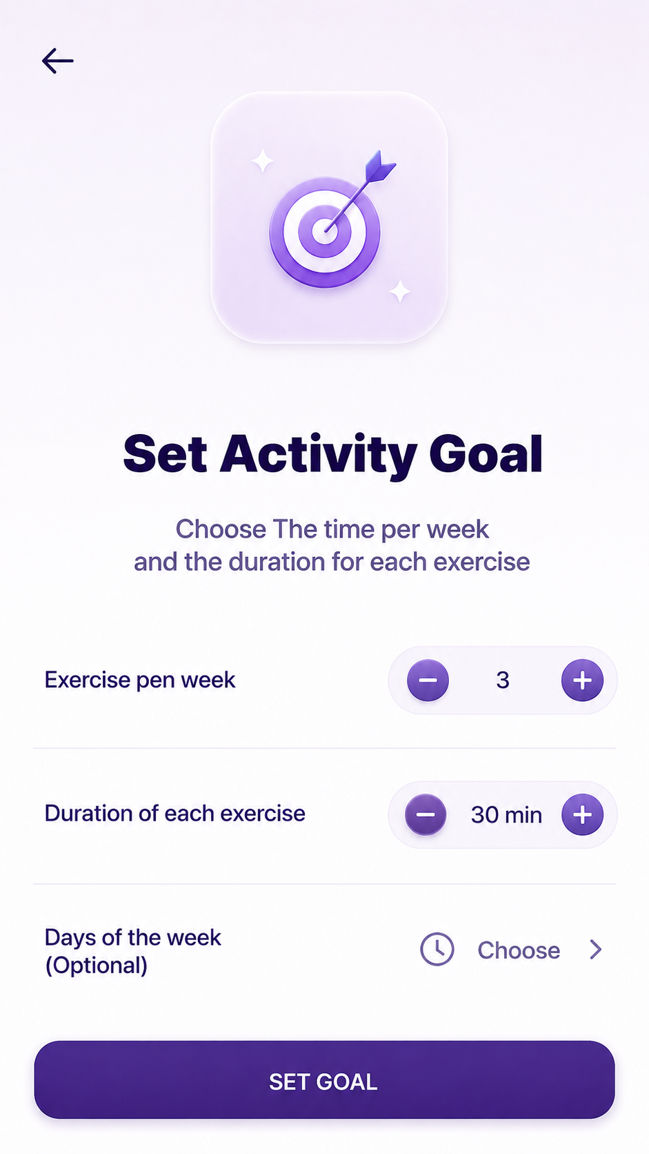
Set Activity Goal screen configuring exercises per week, duration and days.
04
A goal-setting flow

Users could define or shape goals and milestones in ways that reflected their own priorities.

Defining a goal and its milestones, in the patient's own terms.

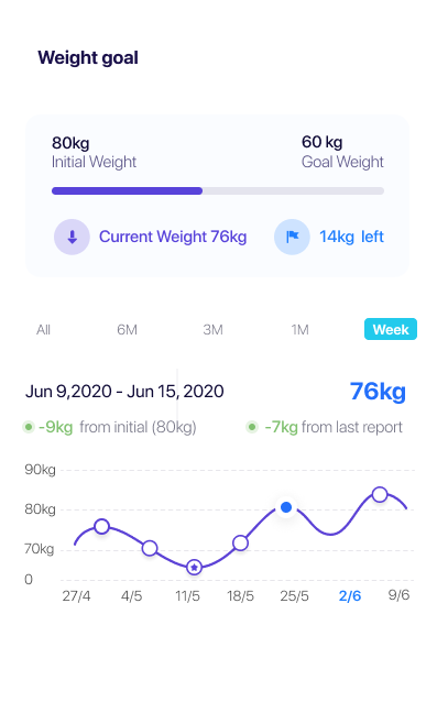
Weight goal tracking screen showing progress toward a target weight over time
Goals across domains

The same logic extended into different health domains, making the goal layer part of the broader experience rather than a standalone feature.

The goal layer recurring inside a specific health domain.

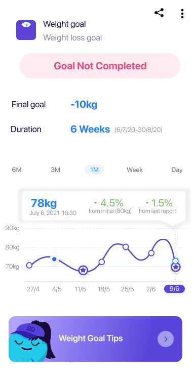
Daily reporting screen shown in relation to the weight goal it serves
Tasks became means, not ends

Daily reporting still supported personalization, but it could now be understood in relation to something the user actually wanted to achieve.

Daily reporting shown in relation to the goal it serves.

Back to the core problem

The app still needed the work.
Now the work was connected to something the patient actually wanted.

Patient effort → Patient value

02

Make the value visible

Homepage · insights · short + long-term progress

The homepage was where value had to come into view. It shaped what patients noticed every time they returned.

The local problem

Patients could keep giving SWEETCH information without clearly seeing what mattered for them right now.

The system needed to surface the most relevant value — without overwhelming them.

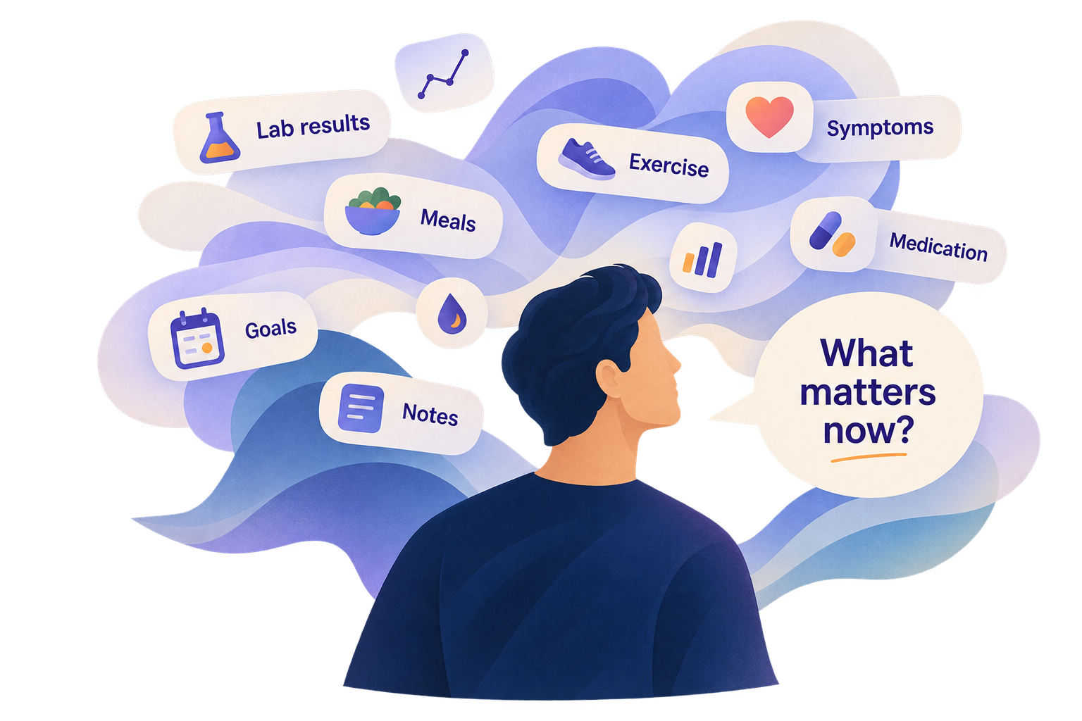
A patient surrounded by health information — lab results, meals, exercise, medication, goals and notes — asking what matters now

Research

What should the homepage surface so patients can quickly understand what matters now — and how it connects to progress over time?

Methods / sources
  • Homepage research
  • Card sorting
  • Focus groups
  • Testing
  • Competitive research

What I learned

Value has to be easy to spot

What matters most should not be buried among everything the product can do.

Now and over time need to work together

Patients need to understand what matters today while still seeing the larger direction of their progress.

Data is not the story

SWEETCH could help connect signals, surface patterns and highlight what might matter — rather than leaving patients to interpret raw information alone.

Today
  • What matters now
  • What needs attention
  • What changed
  • Progress
  • Patterns emerging
Over time
  • What it means
  • Where I'm heading
from immediate visibility to long-term understanding
The experience move

I reframed the homepage as the place where SWEETCH surfaces what matters most.

Instead of treating the homepage as a menu of everything the product could do, I used it to prioritize a personalized story around the patient's goals, current activity, progress and emerging insights.

The question became less "What can SWEETCH show?" and more "What does this patient need to see now?"

Product impact
Goal
personal priority

What matters to me.

Now
immediate relevance

What needs my attention.

Progress
progress

What is changing.

Insights
interpretation

What SWEETCH is noticing.

Guidance
direction

What may help me next.

Deeper health domains
deeper exploration

Where I can explore when I need more detail.

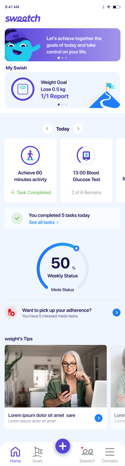
SWEETCH homepage mockup prioritized around the patient's goals and current tasks
Product evidence

The homepage, prioritized around what the patient needs to see now.

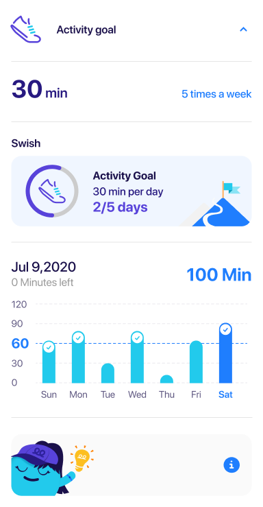
SWEETCH in-progress Activity Goal screen showing weekly progress of 2 out of 5 days, daily progress chart and accumulated minutes
Progress in motion
Make progress visible before the goal is complete

The in-progress state connects daily activity to the larger goal, helping patients see how each action adds up over time.

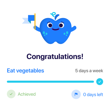
SWEETCH goal-achieved screen congratulating the patient, showing the completed nutrition goal, a full progress bar and an explicit Achieved confirmation
Achievement
Let success feel unmistakable

When a goal is reached, the experience closes the loop with a clear moment of recognition — making the value of continued effort visible.

Research artifact
User Journey Map — the experience across time and repeated moments.
This map showed that value had to work across time — helping patients understand what matters now while staying motivated through the longer journey.
Back to the core problem

The patient did the tracking. SWEETCH needed to help make sense of it.

The homepage made the most relevant value easier to see — now and over time.

Patient effort → Patient value

03

Make support relevant

Companion · character research
The starting vision

Give personalized guidance a human voice.

SWEETCH imagined a companion that could guide patients through daily health decisions — so support felt personal, not clinical or lonely.

The company had a vision. Now the companion needed a job description.

Posted on the wall

The vision was warm. The role it created was demanding.

Written out as a job description, the companion had to carry the brand, the guidance and the relationship — every single day, without wearing out its welcome.

The background check

Before hiring anyone, I did the background check.

Characters are not a new idea. Before designing one, I looked at where they had worked before — and what they were actually hired to do.

  • Literature
  • History
  • Competitive cases
  • A/B feedback
  • Focus testing
A group of well-known marketing mascots standing together as research evidence
Decades of brand mascots — built for recognition and affection, not for guiding someone through a decision.
Mascots in marketing

Great at being remembered.

Usually not responsible for helping you complete a task.

A group of well-known digital-product mascots as research evidence
Mascots in digital products

Some products successfully brought characters into the digital experience.

But persistent in-product companions were surprisingly rare.

Being a great mascot and being a great product companion were not the same job.

Why?

Case 01 — That Clippy mistake
The wrong kind of help becomes noise fast.

Clippy proved that personality alone is not enough — an assistant also has to know when to speak, when to stop, and when to stay out of the way.

The risk wasn’t personality. It was interruption.

Clippy, the Microsoft Office assistant, filed as a failed-case reference
  • Wrong moment
  • Too present
  • Not learning
Case 02 — Cute has a limit
A guiding character can be a lot

If users don’t connect with the character, constant presence becomes friction. Even if they do, too much exposure can wear out the welcome — especially when that character is always there, talking, guiding, and tagging along.

It was putting the whole relationship on one face.

An illustrated companion character trailed by an overwhelming cloud of speech bubbles
Always there. Always talking. Always tagging along.
Case 03 — The Headspace clue
Then a more interesting possibility appeared.

Headspace pointed to a different kind of answer: a product could feel human and expressive without putting the whole emotional load on one permanent character.

Personality did not have to come from one mascot. It could live across a cast.

The clue was not one star character. It was a more distributed kind of presence.

The conclusion

The final call

The research left me with two rules.

01
Relevance comes first

Always move the user forward. Never get in the way.

02
Spread the weight

Don’t ask one character to carry the whole relationship.

The decision

Build a cast, not a star.

A cheerful cast of SWEETCH health companions: a heart, a book, an apple, and a tooth character standing together

I recommended a different character for each health domain — keeping support human and contextual without putting the whole experience on one face.

When the patient entered a health domain, that domain’s character became the voice of support.

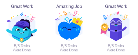
Three friendly SWEETCH health-domain characters celebrating completed tasks: a heart, an apple, and a tooth companion
Move 04

Make the ask feel lighter

Onboarding · pacing · perceived effort

SWEETCH needed detailed health information to personalize the experience. The challenge was making a necessary, lengthy onboarding feel manageable.

How could we keep the depth of personalization without making onboarding feel heavy?

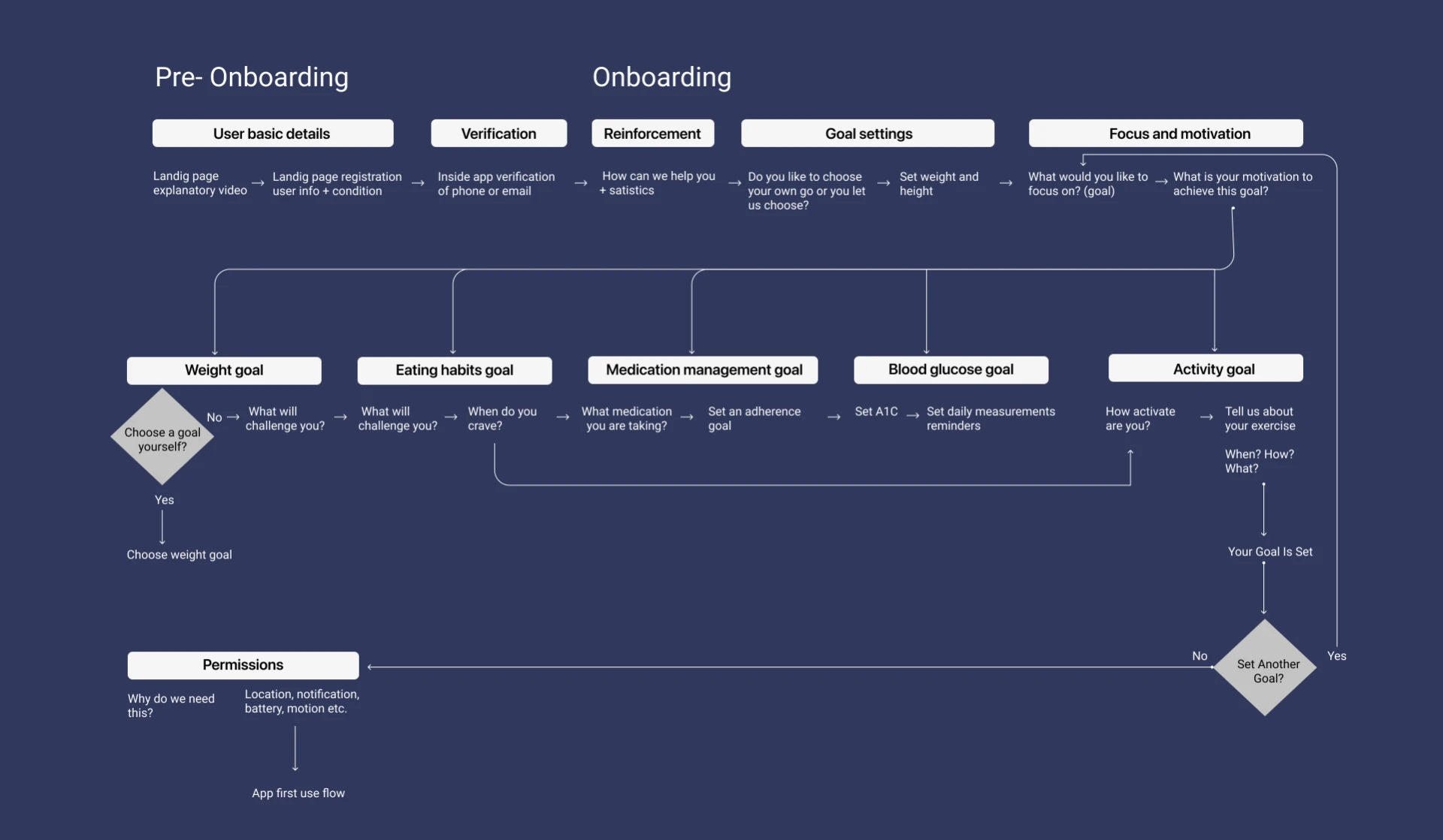
The flow

Personalization required a lot of context — and therefore a lot of patient effort upfront.

Onboarding flow diagram mapping pre-onboarding and in-app onboarding steps
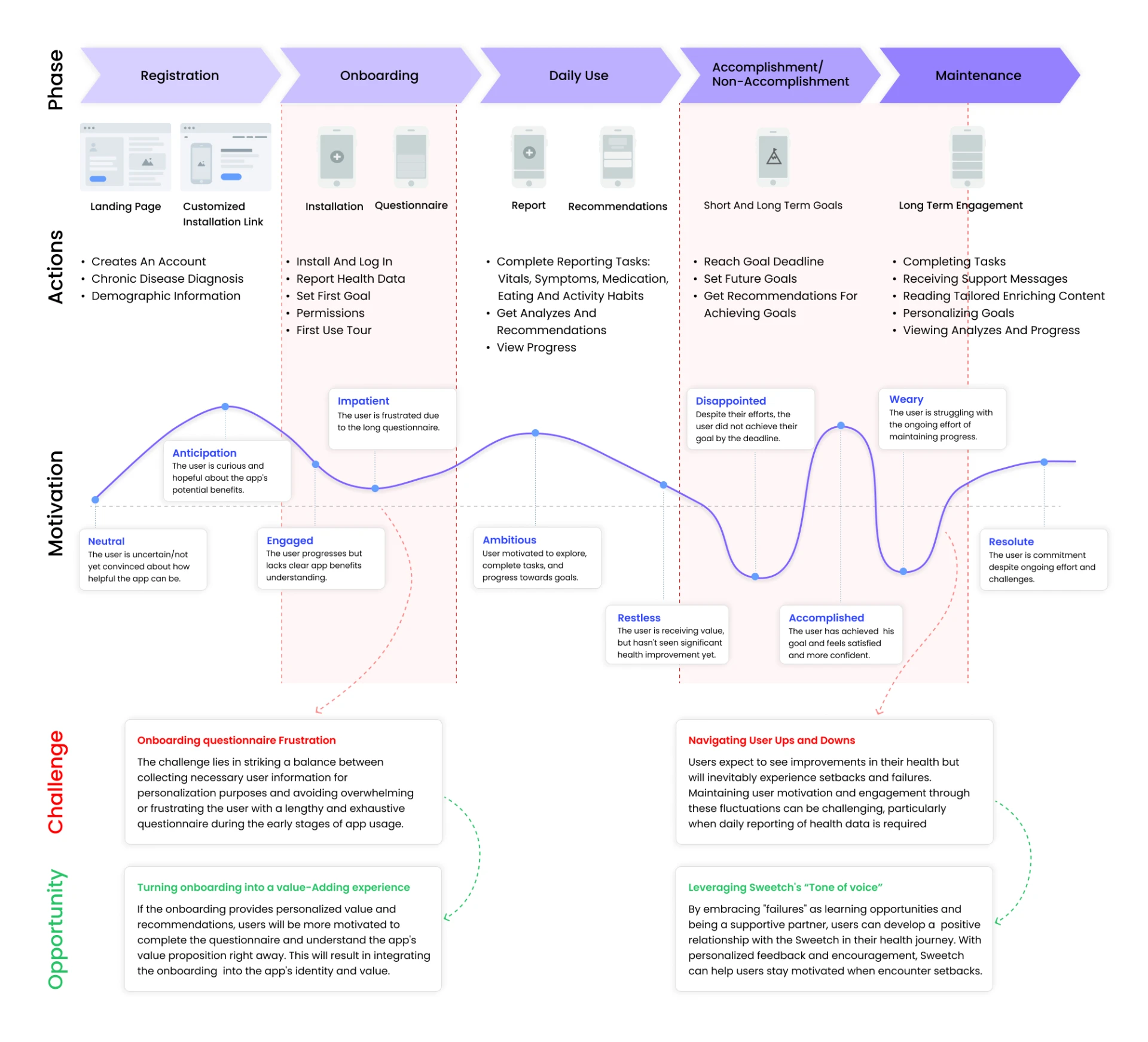
The journey

The willingness to invest that effort was not constant. Motivation changed as effort, progress and setbacks accumulated.

Journey map plotting patient motivation across registration, onboarding, daily use and maintenance

Research

Literature review · Competitive research · A/B testing · Post-use survey

The research pointed to three ways to reduce the perceived weight of the experience.

01
Reinforce progress

Positive messages between questions helped give the process purpose and maintain momentum.

02
Show the payoff early

Previewing personalized features, support and insights gave patients a reason to keep going.

03
Break one long experience into two

Splitting onboarding between the landing page and the app made one long process feel like two shorter experiences.

We didn’t remove the information SWEETCH needed. We changed how the effort was experienced.

Before
One long onboarding

One continuous ask, all upfront.

After
Pre-onboarding

Basic information

In-app onboarding

Goals · health context · personalization

Positive reinforcementbetween questions
Value previewsat each stage

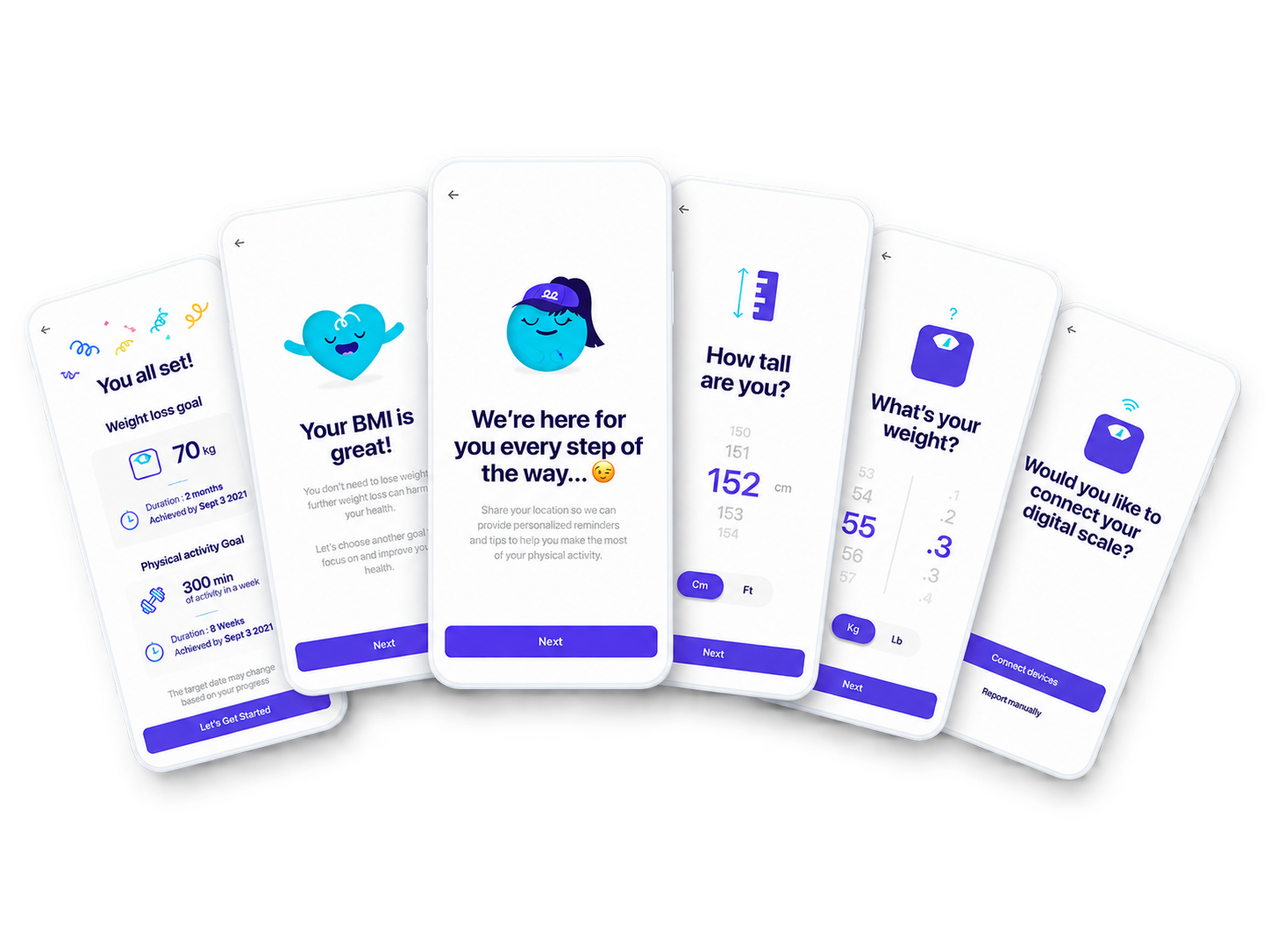
Fan composition of SWEETCH onboarding screens showing the lighter paced setup flow
Chapter IV

How could we make the ongoing effort of self-tracking feel worth it?

Give every effort somewhere meaningful to go.

  • Meaning
  • Understanding
  • Progress
  • Relevant support
What matters to me

My Goals

A connected system

A connected system that helps me focus effort where it matters and drive meaningful progress.

Meaning

Give the effort a reason

  • GoalsDefine what matters and why it matters.

Understanding

Turn data into something useful

  • InsightsDiscover what the data is telling me.
  • Contextual guidanceGet timely tips and nudges.

Progress

Make change visible now and over time

  • TodayFocus on the right next step.
  • TrendsSee progress and patterns over time.

Relevant support

Help in the moment that matters

  • HomepageSee what matters at a glance.
  • Domain guidesGo deeper with expert guidance.

OnboardingMake the first effort manageable

Reinforce progress · Show the payoff early · Break one long experience into two

The decision framework behind the experience

These principles became a shared lens for product decisions across the experience.

01

Does this connect effort to something the patient cares about?

02

Does it help the patient understand what their data means?

03

Does it make progress visible now and over time?

04

Is the support timely, relevant, and easy to act on?

Our north star

Is the value clear enough to justify the effort?

Are you wondering...

“Can I see the full final experience?”

I wish.

Much of the final product work belongs to SWEETCH and can’t be shared publicly. What I can show here is part of the research, systems, decisions, and selected product evidence behind the experience.

If you’d like to go deeper, I’m happy to walk through what I can share privately.

Let’s talk →